WorkfloPlus Design System
As part of my role as Senior Product Designer, I set about creating an all-encompassing and robust design system to try and promote autonomy within the development team. This design system could be used when developing new areas of the product, ensuring a consistent user experience, user interface, and that is on-brand & thematically correct to all other areas of the product.

Colour Palettes & Usage
Primary Colour Palette

Secondary Colour Palette

Colour Usage
Use appropriate colours for backgrounds and content
Ensuring the content is an appropriate colour to the background ensures everything is clear and legible no matter the screen size and resolution

The square on the right is using a background colour very similar to the star, making it difficult to view
Use appropriate colours to emphasise an icon or button’s action.
Ensuring the use of appropriate colours to emphasise an icons button (Red for destructive actions, blue for neutral and green for positions/completion) gives the user a clearer User experience.

The button of the left uses red correctly the show that the delete action is destructive
Colourblindness Consideration
Below are examples of how our colour scheme is affected by the most commonly recognised colour blindness

1) Unaffected Colour Scheme, 2) Red-Weak/Protanomaly, 3) Green-Weak/Deuteranomaly, 4) Blue-Weak/Tritanomaly, 5) Red-Blind/Protanopia, 6) Green-Blind/Deuteranopia, 7) Monochromacy/Achromatopsia
Text Legibility
Dark text on light backgrounds
Dark text on light backgrounds (shown here as #293148 on #FFFFFF) applies the following opacity levels:
1) High-emphasis text has an opacity of 100%
2) Medium-emphasis text and hint text have an opacity of 50%
3) Disabled text has an opacity of 25%

1) Text, 2) Background, 3) Text Selection Colour
Helper Text
For example, helper text on light backgrounds could apply the following opacity levels and default hexes:
1) High-emphasis helper. This text uses a hex code #293148 at 100% opacity
2) Medium-emphasis helper. This text uses a hex code #293148 at 50% opacity
3) Default error helper. This text uses a hex code of #D54E00 at 100% opacity

Selected Text
To reflect the brand, text selection is an accent of our secondary colour.
The selected text should be legible against the selection colour, and the selection colour should contrast the background colour. Alternatively, you can display outlines, motion, checkmark icons, or other text treatments to indicate selected text.

The WorkfloPlus Design System type scale includes a range of contrasting styles that support the needs of your product and its content.
The type scale is a combination of 13 styles that are supported by the type system. It contains reusable categories of text, each with an intended application and meaning. (Scaling determined by material conventions)
Text Scale

Headlines
Below are examples of how different headline scales are correctly applied within the dashboard.

A display style is used for Headline 5 (Roboto, Medium, 24pt)

A display style is used for Headline 6 (Roboto, Medium, 16pt)
Body
There are two different scales used for the body. Below are examples of how different body scales are correctly applied within the dashboard.
Body 1 is used for general use, whether it be small or large bodies of text.
Body 2 is exclusively used within data tables allowing for the use of more characters within a limited space

A display style is used for Body 1 (Roboto, Regular, 14pt)
A display style is used for Body 2 (Roboto, Regular, 12pt)
Buttons
Button text is a call to action using different types of buttons (such as text, outlined and contained buttons) and in tabs, dialogues, and cards.
Button text is typically an all-caps sans serif.

A display style is used for Button (Roboto, Medium, All Caps, 14pt)
Types
Text fields come in two variants:
1) Filled text fields
2) Outlined text fields
Both types of text fields use a container to provide a clear affordance for interaction, making the fields discoverable in layouts.
Text Fields

1) Filled text field, 2) Outlined text field
Anatomy

1) Container, 2) Leading Icon (Optional), 3) Label Text, 4) Input Text, 5) Trailing Icon (Optional), 6) Activation Indicator, 7) Helper Text
Container
Containers improve the discoverability of text fields by creating contrast between the text field and surrounding content.
Fill & Stroke
A text field container has a fill and a stroke (either around the entire container, or just the bottom edge). The colour and thickness of a stroke can change to indicate when the text field is active.
Rounded Corners
The container of an outlined text field has rounded corners, while the container of a filled text field has rounded top corners and square bottom corners.

Containers
Label Text
Label text is used to inform users as to what information is requested for a text field. Every text field should have a label.
Label text should be aligned with the input line, and always visible. It can be placed in the middle of a text field, or rest near the top of the container.

Two examples of Label Text being correctly applied to a text input box

Two examples of Label Text being incorrectly applied to a text input box
Don’t - Label text shouldn’t take up multiple lines.
Don’t - Label text shouldn’t be truncated. Keep it short, clear, and fully visible.
Required Text Indicator
To indicate that a field is required, display an asterisk (*) next to the label text and mention near the form that asterisks indicate required fields.
1) If some fields are required, indicate all required ones
2) If most fields are required, indicate optional fields by displaying the word “optional” in parentheses next to the label text
3) If the required text is coloured, that colour should also be used for the asterisk.

Required text with asterisk indicator
Assistive Elements

Assistive elements provide additional detail about text entered into text fields.
1) Helper Text
Helper text conveys additional guidance about the input field, such as how it will be used. It should only take up a single line, being persistently visible or visible only on focus.
2) Error Message
When text input isn’t accepted, an error message can display instructions on how to fix it. Error messages are displayed below the input line, replacing helper text until fixed.
3) Icons
Icons can be used to message alerts as well. Pair them with error messages to provide redundant alerts, which are useful when you need to design for colourblind users.
Error Messages
For text fields that validate their content (such as passwords), replace helper text with error text when applicable. Swapping helper text with error text helps prevent new lines of text from being introduced into a layout, thus bumping content to fit it.
A) If only one error is possible, the error text describes how to avoid the error
B) If multiple errors are possible, error text describes how to avoid the most likely error

Do - Swap helper text with error text | Don’t - Place error text under helper text.

Caution - Long errors can wrap to multiple lines if there isn’t enough space to clearly describe the error. In this case, ensure padding between text fields is sufficient to prevent errors from bumping layout content
Icons
Icons in text fields are optional. Text field icons can describe valid input methods (such as a microphone icon), provide affordances to access additional functionality (such as clearing the content of a field), and can express an error.
Leading and trailing icons change their position based on LTR or RTL contexts.

1) Valid or Error Icon
Iconography can indicate both valid and invalid inputs, making error states clear for colourblind users.
2) Clear Icon
Clear icons let users clear an entire input field. They appear only when input text is present.
3) Voice Input Icon
A microphone icon signifies that users can input characters using voice.
4) Dropdown Icon
A dropdown arrow indicates that a text field has a nested selection component.
5) Icon Signifier
Icon signifiers can describe the type of input a text field requires, and be touch targets for nested components. For example, a calendar icon may be tapped to reveal a date picker.
Form View/Input Types
Text fields can display user input in the following ways:
1) Single Line Text Field - Displayed only on one line
2) Multi-line Text Field - Grows to accommodate multiple lines of text
3) Text Area - Fixed-height fields

1) Single-line Field
In single-line fields, as the cursor reaches the right field edge, text longer than the input line automatically scrolls left.
Single-line fields are not suitable for collecting long responses. For those, use a multi-line text field or text area instead.
2) Text Area
Text areas are taller than text fields and wrap overflow text onto a new line. They are a fixed height and scroll vertically when the cursor reaches the bottom of the field.
The large initial size indicates that longer responses are possible and encouraged.
These should be used instead of multi-line fields on the web. Ensure the height of a text area fits within mobile screen sizes.
3) Multi-line Fields
Multi-line text fields show all user input at once. Overflow text causes the text field to expand (shifting screen elements downward), and the text wraps onto a new line.
These fields initially appear as single-line fields, which is useful for compact layouts that need to be able to accommodate large amounts of text.
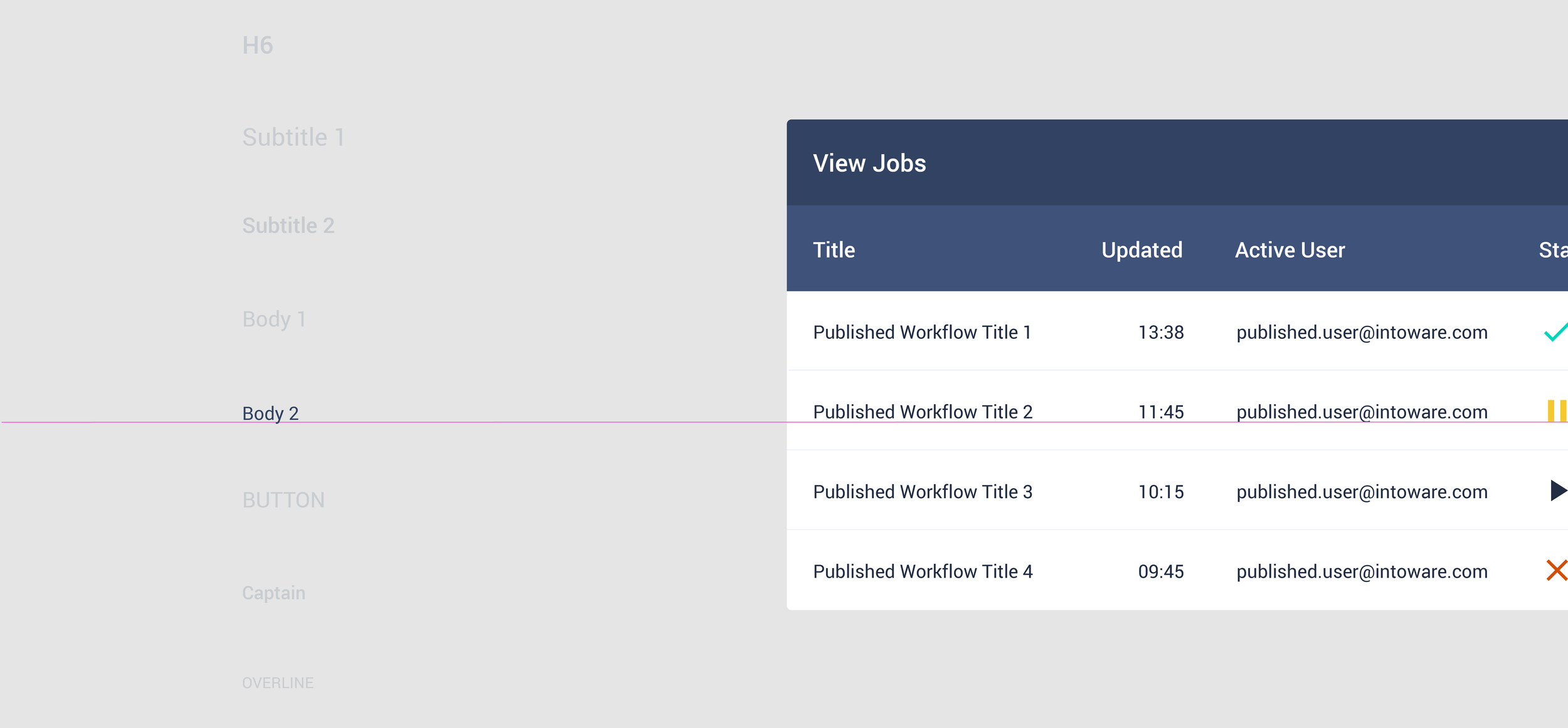
Data Table
Data tables panels display sets of data across rows and columns

Columns
Height & Padding
The baseline row height is 52px, and the column headers row height is 56px
(4px taller than regular rows) (change for margin rule w/ ems)

Padding
There is 32px or more of padding between columns

There is padding on the left and right side of each header name.
Text
Column header text is 14pt and uses a medium-weight font (to differentiate it from row text which is 12pt and regular weight)
Text that is longer than the column width is truncated with an ellipsis. On hover, a tooltip shows the full name.

Example of truncation with an ellipsis.

Hovering over a truncated column header reveals the full text, using a tooltip.
Behaviour
Row Hover (Desktop)
When a user hovers over a row, that row displays a background colour

Hovering over a row
Column Hover (Desktop)
When the user hovers over a column hover
1) A tooltip can display the full column name (if it’s truncated) or a detailed description
2) If sorting is enabled, an arrow icon can appear next to the column’s header

A tooltip or a downward or upward arrow icon can be displayed when hovering over a column name
Theming
Colour
Workfloplus’ data tables use custom colour on five elements: the container, the header, header text, table text and dividers

Typography
WorkfloPlus’ data tables adhere to the typography conventions below


Buttons
Buttons allow users to take actions, and make choices, with a single tap.
Text Button
Text buttons are typically used for less important actions..
Outlined Button
Outlined buttons are used for more emphasis than text buttons due to the stroke.
Contained Button
Contained buttons have more emphasis, as they use a colour fill and shadow.
Icon Button
Icon buttons are used when a large number of actions can be performed from a single panel. (Ensure that tooltips are always used as some icons without accompanying texts could be confusing to new users)

Tooltip displaying the description of an Icon Button
Button States

Text Button States
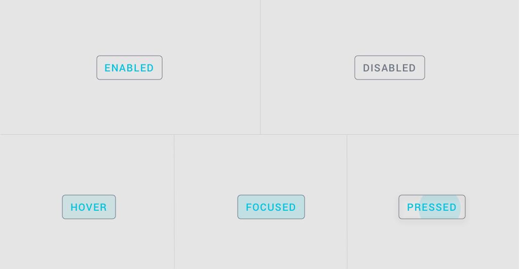
Outline Button States

Contained Button States
Usage
Below are examples of panels and modals using an array of different buttons with explanations as to why certain buttons are used in different circumstances as well as examples of how a button can be implemented incorrectly

1) Outline Button
An outline button is used here instead as a contained button because while it’s important for it to be clearly visible it’s not the action that needs to have the most emphasis on the modal
2) Contained Button
A contained button is used here because action needs to have the most emphasis on the modal

1) Outline Button
Icon buttons are used when you have a large number of actions that can be performed from a panel. To save space these icons don’t have a title so must have a tooltip explaining to the user what action they perform
2) Contained Button
A text button can be used when you need a button but have limited space. I’d recommend using them over an “Icon Button” if the action in question is limited to the panel you’re on and no opening a new one. Text buttons must be in all caps to differentiate them from normal text
Misusage

Don’t place a button below another button if there’s space to place them side by side

Only use Icon Buttons when you have multiple actions to go on one panel

Ensure the colour of the button correctly reflects it’s action
Selection Control
Selection controls allow the user to select options
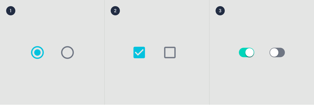
1) Radio Button, 2) Checkboxes, 3) Switches
Radio Buttons
Usage
Radio buttons allow the user to select one option from a set. Use radio buttons when the user needs to see all available options. If available options can be collapsed, consider using a dropdown menu because it uses less space.
States
Radio buttons can be selected or unselected. Radio buttons have enabled, hover, focused and pressed states.

Checkboxes
Usage
Checkboxes allow the user to select one or more items from a set. Checkboxes can be used to turn an option on or off.

States
Checkboxes can be selected, unselected, or indeterminate. Checkboxes have enabled, hover, focused and pressed states.

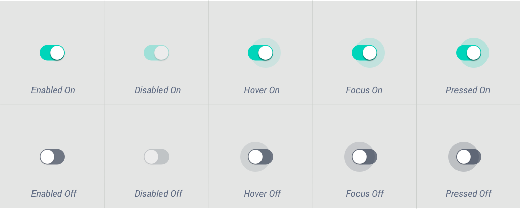
Switches
Usage
Switches toggle the state of a single setting on or off. They are the preferred way to adjust settings on mobile.
State
A switch is successfully toggled when the user slides a switch thumb to the other side of the track, and the state of the switch changes.

1) Thumb, 2) Track
Text Label
The option that the switch controls, as well as the state it’s in, should be made clear from the corresponding inline label.
Avoid creating a switch that includes the text “on” and “off” within the graphic itself. The switch alone should be sufficient.
Specs
